EXPANSE
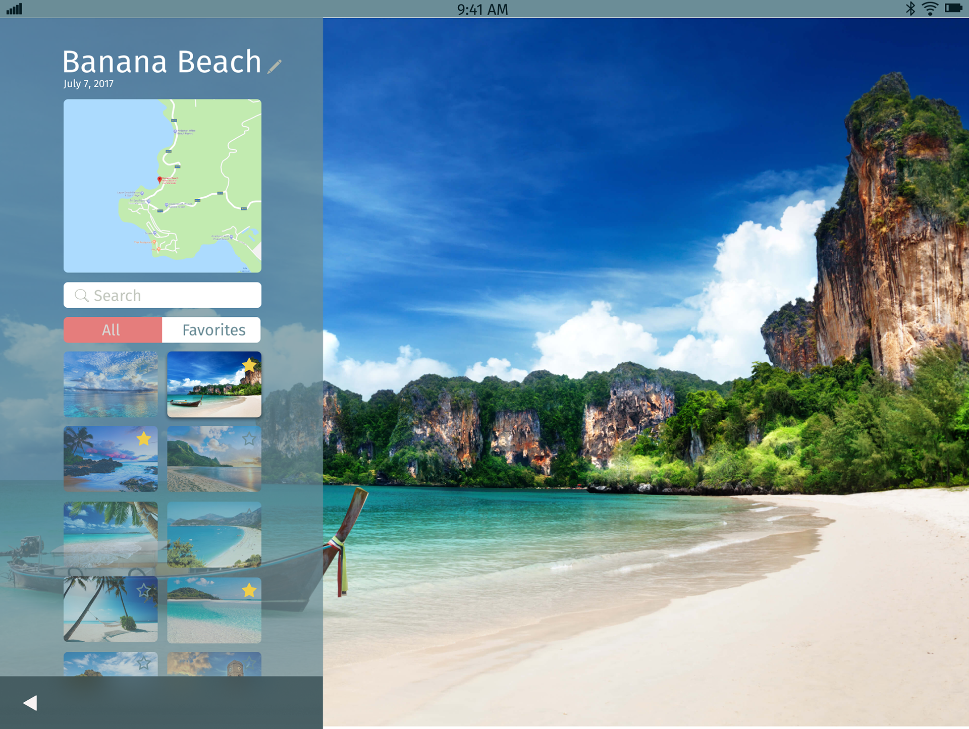
Application design generally focuses on the mobile or notebook screen, but what about tablets? Expanse was an effort to create a design system and application ecosystem that prioritized the tablet form factor. Given the unique interaction model and distinct behavioral expectations of tablets, this proved to be more of a challenge than might have been expected.
Tools
Figma, Photoshop
My Roles
UX Designer, Product Designer, Project Manager
Design Process
The first thing our team needed to understand was what was unique about the tablet environment. What constraints existed that we needed to understand? How did people interact with it? What were the expectations around its behavior?
A combination of user research and personal experience led us to a few key points of understanding:
1. Landscape orientation is more important to this form factor than it might be for phones.
2. Generous consideration needs to be given to how users hold a tablet when actively using it vs passively consuming information from it.
We also developed three unifying design principles to guide our process:
1. Use space efficiently – The large screen of tablets often gives way to sparse or, conversely, cluttered interfaces. We would make judicious use of the plentiful space provided.
2. Prioritize content – We would take advantage of the screen real estate to let content sing.
3. Design for on-the-go users who need easy information access – We would minimize or eliminate unnecessary screens or interactions that delay access to information.
Using these tenets and principles as a foundation, we brainstormed various interaction models that could be used as part of a design language encompassing a suite of expected applications in an OS ecosystem – an email client, a browser, a media player, and so on.
Eventually, we arrived at a 1/3 – 2/3 scheme. Each application would be defined as part of the ecosystem by its adoption of the use of a 1/3 screen width left-hand sidebar and a 2/3 screen width content pane. Each application in the design system would adopt an identifying color but they would all be recognizable as part of the ecosystem through consistent design elements like the screen split and ubiquitous interactive elements.
Gestures
We also felt there was an opportunity to create a new interactive method, what we called “the dial.” This three-finger motion switches between 1/3,2/3 view and full screen view.
Applications
Browser

Search
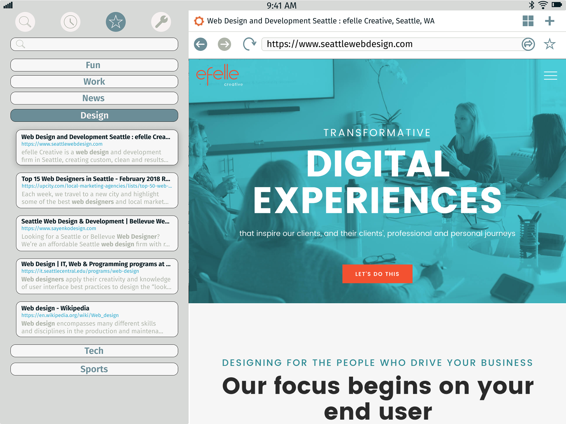
Favorites
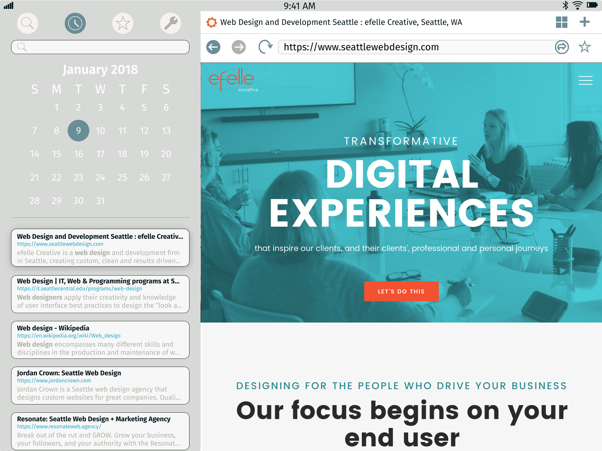
History
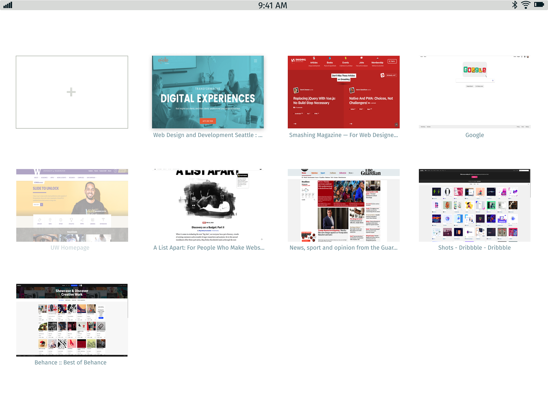
Tabs
There was no question regarding the decision to include a browser in Expanse. One unique feature of this particular browser was what I called the "Source Box." Just below the search bar in the upper right, the Source Box would take search terms and evaluate them against contextually appropriate web-based tools and platforms like IMDB, Wikipedia or Amazon that a user could easily cycle though. More traditional search results would be presented in contained search cards below the Source Box.
Camera
There was some discussion about the validity of including a camera as part of the suite of applications. Camera usage in tablets is less common, typically taking the form of video conferencing using the front-facing camera and standard photography is rare. Despite this, I created a possible camera system that would use the Expanse design language.
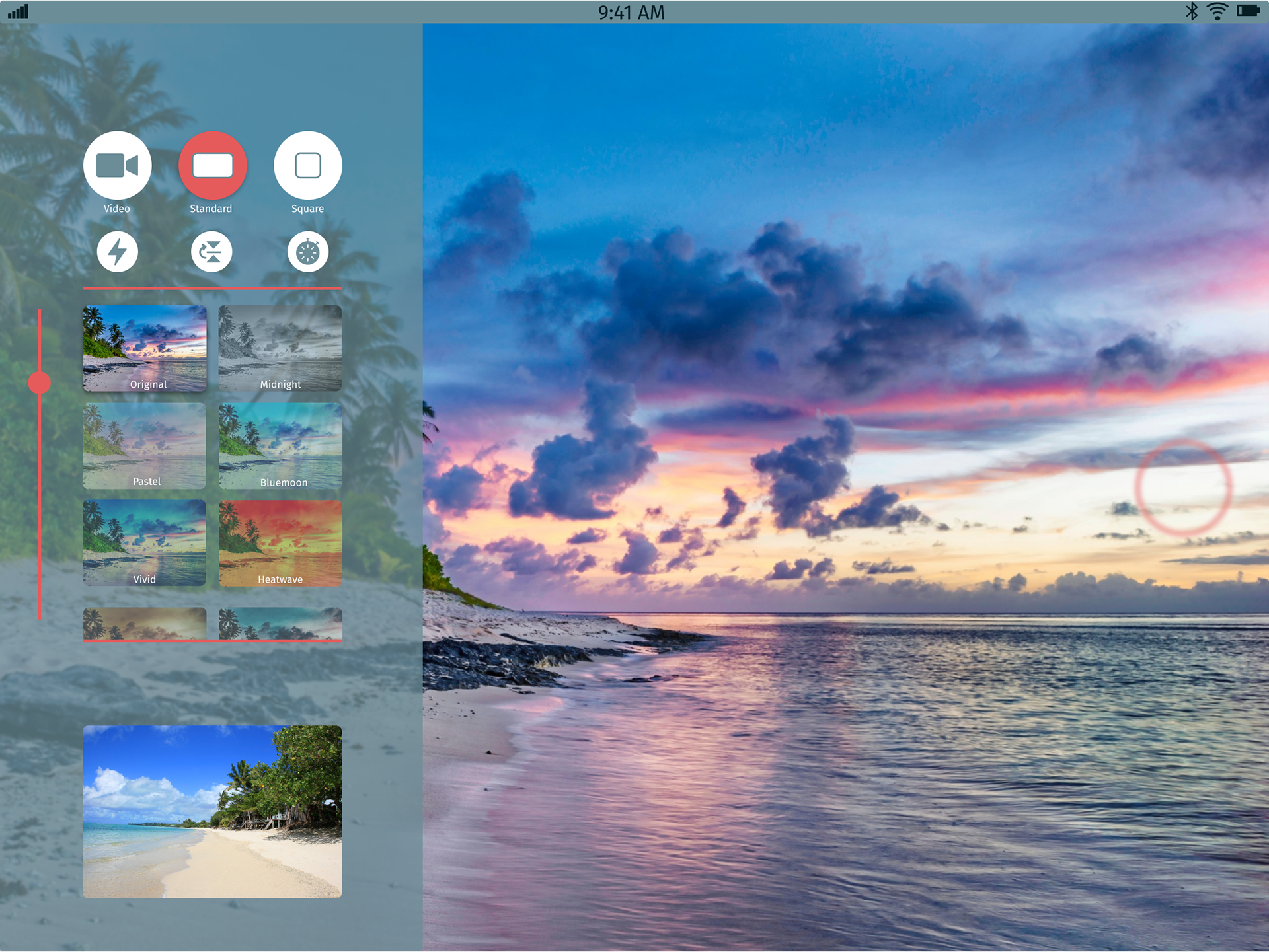
Camera with UI
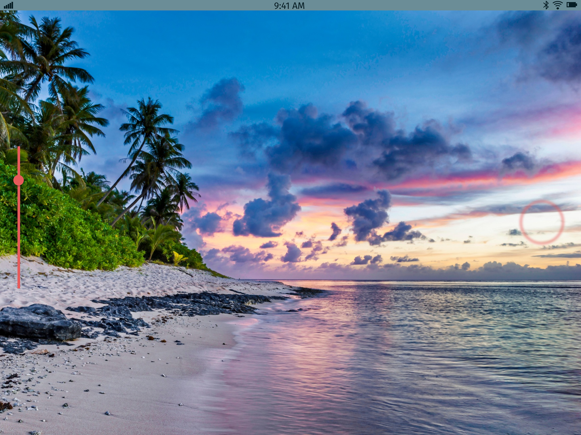
Camera - No UI
