THE GIANT SQUID
For centuries, the giant squid was a terrifying legend. Over time, however, as valid scientific samples were collected and researchers learned more about them, the truth about “the kraken” was revealed. This infographic illustrating various aspects of my favorite sea creature was an exercise that explored the use of inspirational color, layout and type sources to inform an original design.
Tools
Illustrator, Photoshop, Tableau
My Role
As the sole designer on the project, I was responsible for every aspect of this work, from research to design and construction.
Design Process
The goal of this project was to design an effective infographic with a foundation of visual language, color, layout and type choices informed by existing infographic examples. After reviewing hundreds of projects, I settled on the below. They included elements I thought were evocative of the natural world and thus suitable for the tone I had in my head for the finished project.
Layout
This layout, with a centered subject and surrounding, smaller pieces, was immediately attractive to me. It not only highlighted the subject but lead the reader's eye from section to section with clearly delineated pieces of information. The defined "title" banner at the top and the reverse "L" shape of the overall layout were the two primary elements that I would use in my design.
Type and Color
Given my subject matter, the giant squid, and it's relationship to old stories of the sea, I wanted to evoke a period of old nautical literature, with "vintage" but readable text and colors that were reminiscent of the ocean as well as weathered text. This infographic had both of those elements.
Visual Language
Again, in a nod to the oceanic nature of my subject, I thought incorporating circles would be useful and reinforce the theme of the infographic. This example made heavy use of circles to highlight important data points, a method I used in multiple sections of my design.
Armed with these choices, I began an iterative process, building each element individually and gradually adding them into the final design, tweaking and shaping as I went. Outside critique was vital to this process, as was creating multiple versions of elements to explore ideas.
Evolutions
Timeline
From the start, I thought the use of a tentacle, an iconic representation of the squid, would be perfect as part of a timeline. But after multiple revisions and rounds of outside critique, it was clear that, while stylistically interesting, it got in the way of the information I needed to convey. The final version instead incorporated a much simpler line-based design that was cleaner and easier to read.
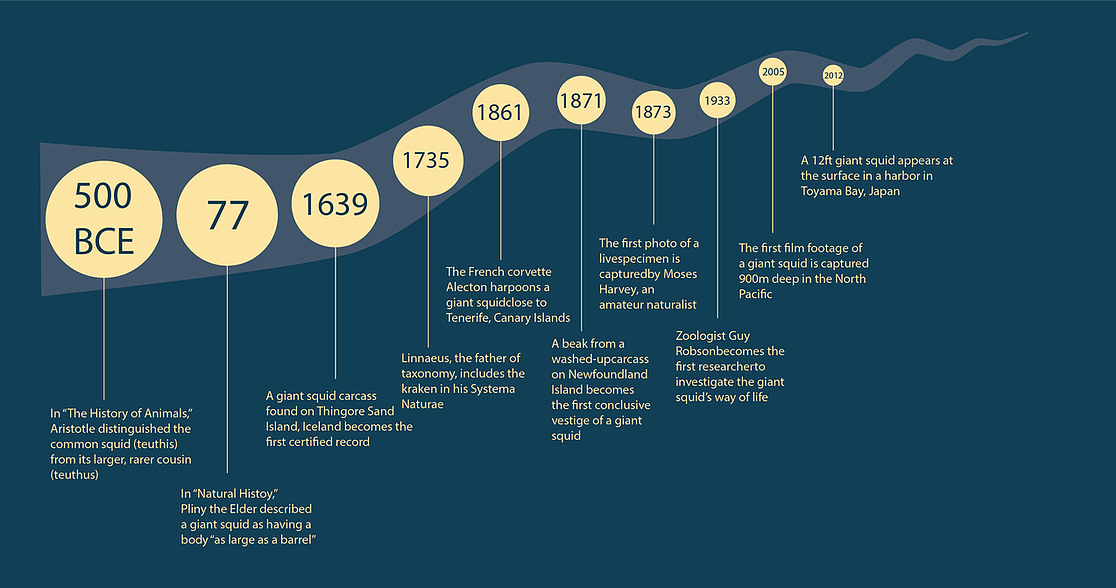
Inital version
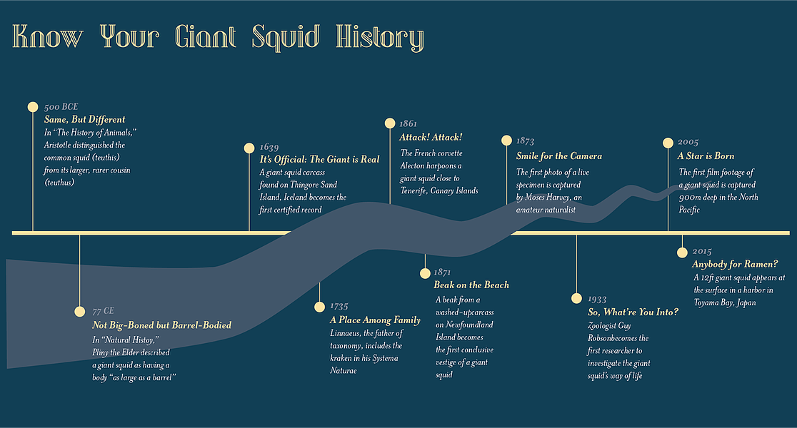
First revision
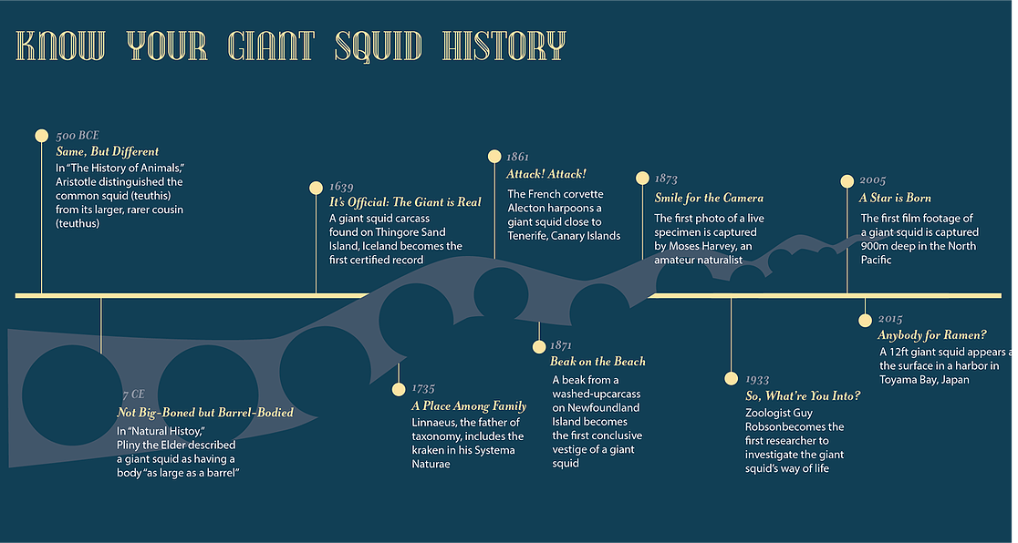
Second revision
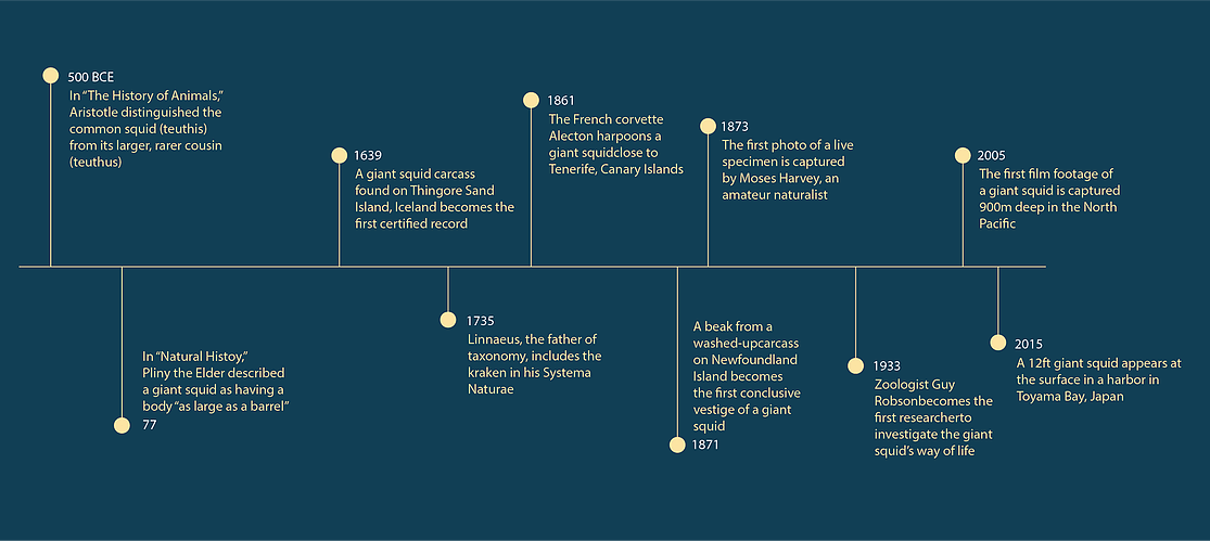
Final version
Relationship
Illustrating the giant squid's place in the natural world in an interesting but still informative way proved to be more difficult than I originally thought. After discarding my original, line-based design to adopt the ocean-evocative circles, it took multiple iterations to settle on a scheme and color usage that met my goals.
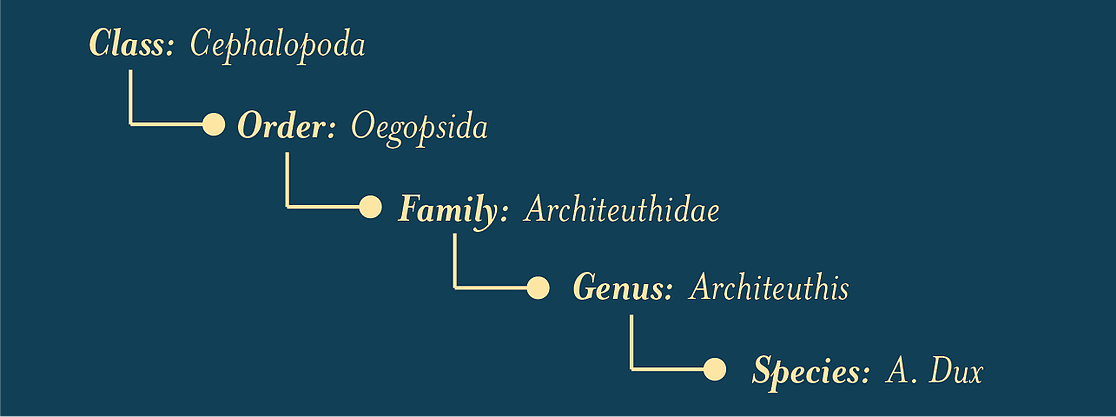
Initial version
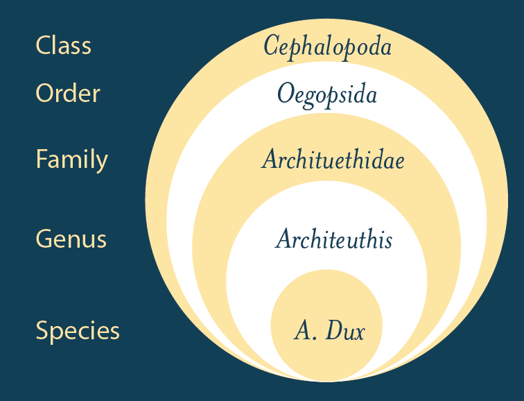
First revision
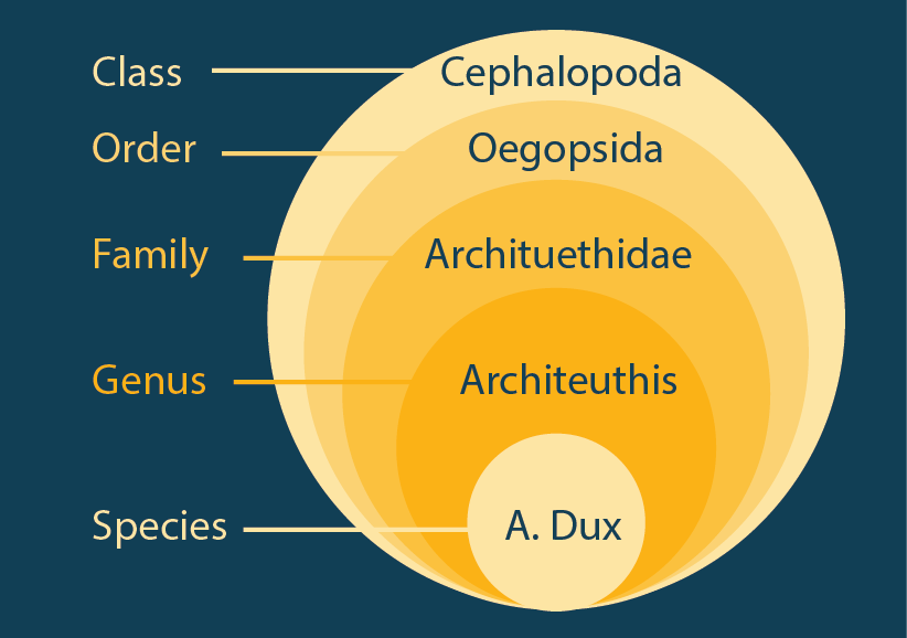
Second revision
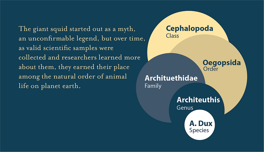
Final version
Challenges
Unique to this project was the intentional use of inspirational sources for color, visual language, layout and type. Choosing infographics that I would use to inform the final design meant that while a roadmap of sorts was available, I was constrained by it and forced to work within it, all while simultaneously learning new tools (Adobe Illustrator, Tableau) as well as a new discipline (visual information design).
The design process was also informed by frequent critique and feedback from colleagues engaged in the same exercise. This feedback was invaluable and guided the project in directions I wouldn’t have considered. It challenged my initial decisions and encouraged me to explore new avenues of expression.
Final Version