SPRY
CHALLENGE
Spry was “the first on-demand mobile PR network” and attempted to disrupt the established public relations business. Currently, the PR industry thrives on the agency/billable hour model. Spry introduced the gig economy to this space, connecting those needing communications services with PR freelancers, cutting out the expensive agencies and making PR accessible to anyone who needed it. Originally only a mobile application, my work centered on creating a web version of the Spry platform.
Unfortunately, Spry was shut down by its holding company owners before the web app was completed.
Unfortunately, Spry was shut down by its holding company owners before the web app was completed.
TOOLS
XD, Photoshop
ROLE(S)
Lead UX Designer, Product Designer, Project Manager
GOAL
In order to broaden Spry's reach, it needed to move beyond a mobile-only experience. Customer's were asked a part of how Spry worked to often submit a volume of text that might be inconvenient to do on a phone, for example. My task was to take the functionality of the Spry mobile app and translate and expand it for a desktop setting.
PROCESS
Because Spry had already existed as a mobile application (actually two applications, one for each end of the transaction - one app for freelancers to find work and another for businesses or individuals looking for freelancers), there was some initial concern about how a web-based version should function. Should it be a nearly direct replication of the mobile experience? Should it also be two different experiences? Visually, how close should it hew to the mobile experience?
Ultimately, the decision was made to not only pursue integration of the two mobile apps but to use this opportunity to create a new, unified web experience that would be the flagship for a new look and feel for the platform. This gave me the freedom to explore interactions and workflows separate from those already established by the mobile apps. Given adoption was low (the apps were very new and gaining user traction proved to be difficult, a common startup problem) there was little or no risk of alienating users with a new, different experience.
Ultimately, the decision was made to not only pursue integration of the two mobile apps but to use this opportunity to create a new, unified web experience that would be the flagship for a new look and feel for the platform. This gave me the freedom to explore interactions and workflows separate from those already established by the mobile apps. Given adoption was low (the apps were very new and gaining user traction proved to be difficult, a common startup problem) there was little or no risk of alienating users with a new, different experience.
RESEARCH
Understanding the space Spry would compete in meant understanding the common design patterns and workflows used by similar, gig economy platforms. I performed an in-depth competitive analysis of platforms like Fiverr and Upwork to understand what could be applied to Spy and what opportunities existed to exploit.
DESIGN
Below are a few examples of how the Spry web application evolved over numerous iterations.
MAIN PAGE
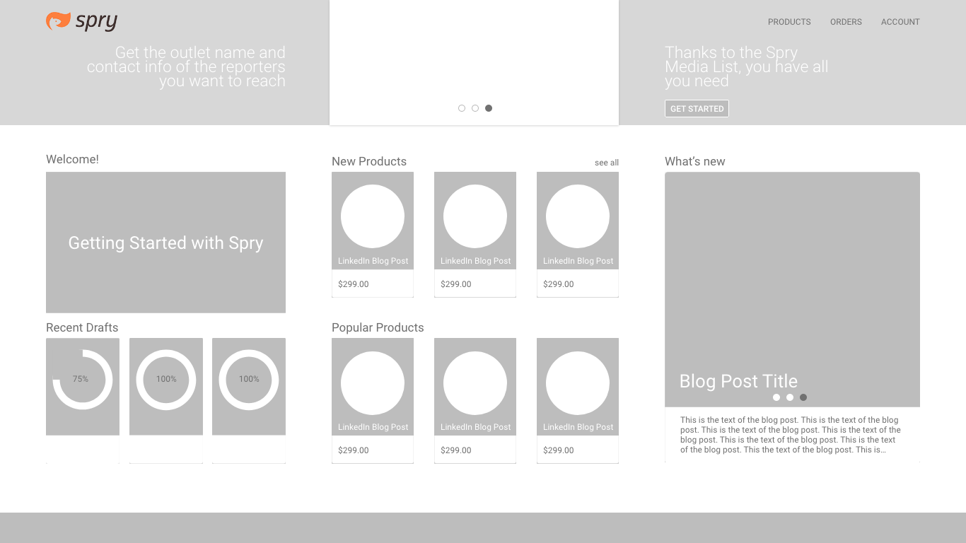
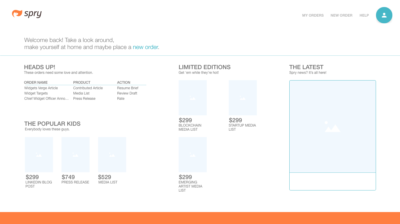
The main page was designed to serve as a one-stop landing page for everything a Spry customer would need, from ordering a new product to viewing the status of in-progress products and taking any necessary actions to have them completed. The initial design was perhaps a little too busy and drew attention in multiple directions, so later iterations focused on providing more visual space through the use of whitespace. I wanted to give each section of the page room to breath but still provide useful information to the user.
MY ORDERS PAGE
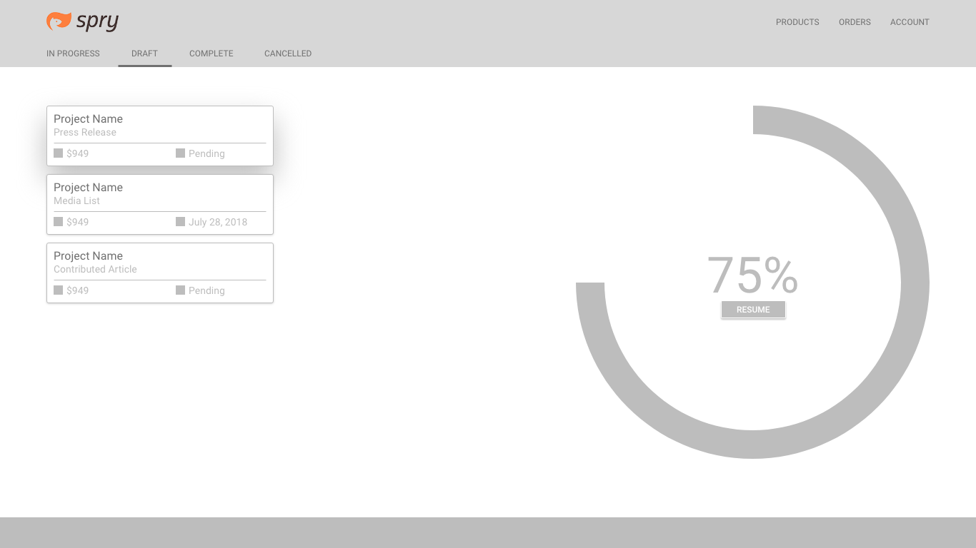
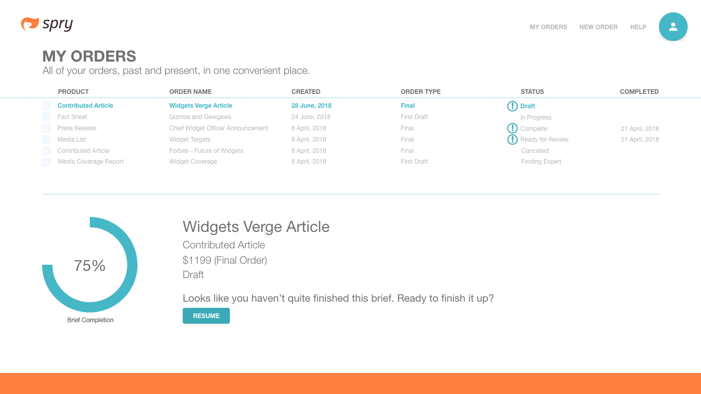
Originally, the design of this page provided a minimal amount of information and perhaps leaned too heavily on the notion of whitespace. The progress circle was unnecessarily large and impacted how information could be represented. The final version shifted from a two column design to a two row design and yielded much better results. Users could view much more information at a glance about their orders.
ALL PRODUCTS PAGE
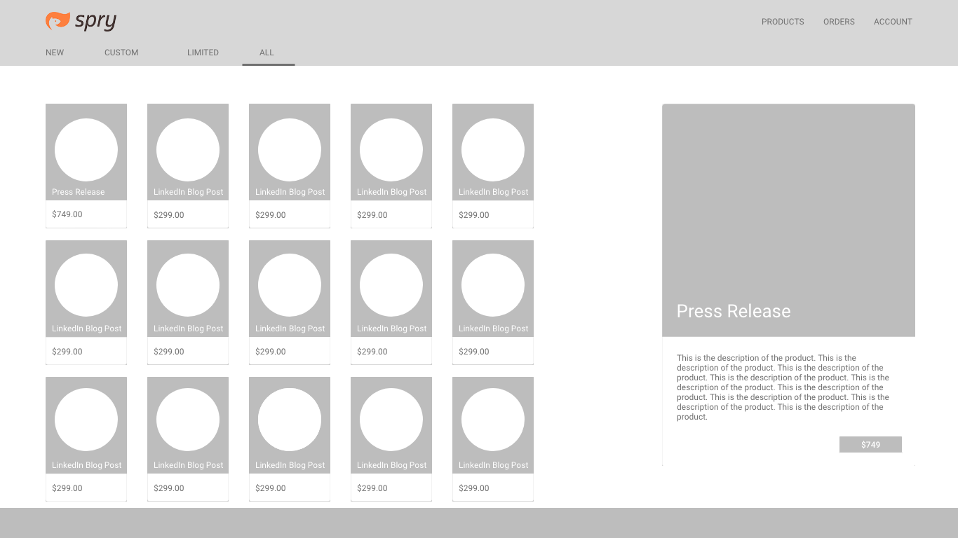
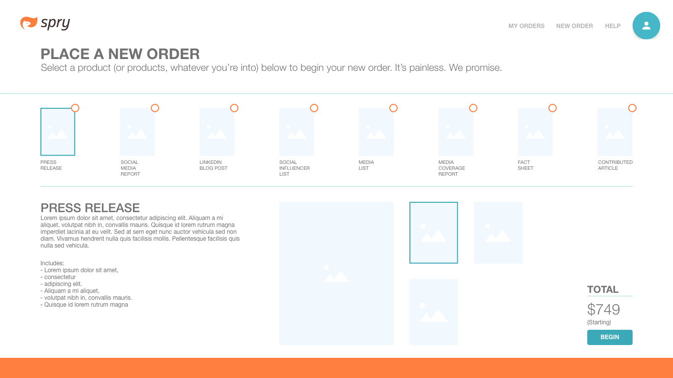
This page was designed to show every possible product available from Spry and kick off the ordering process. The original design included tabs to navigate between evergreen products and those available for a limited time. User research showed that some products were getting lost in this UI and users were never seeing them, so I made the decision to constrain time limited products to the landing page where they could be highlighted and have the all products page contain only those evergreen products. Further real world testing would determine if this was a good decision.
NEW ORDER PROCESS
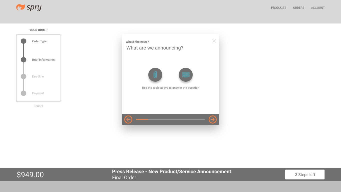
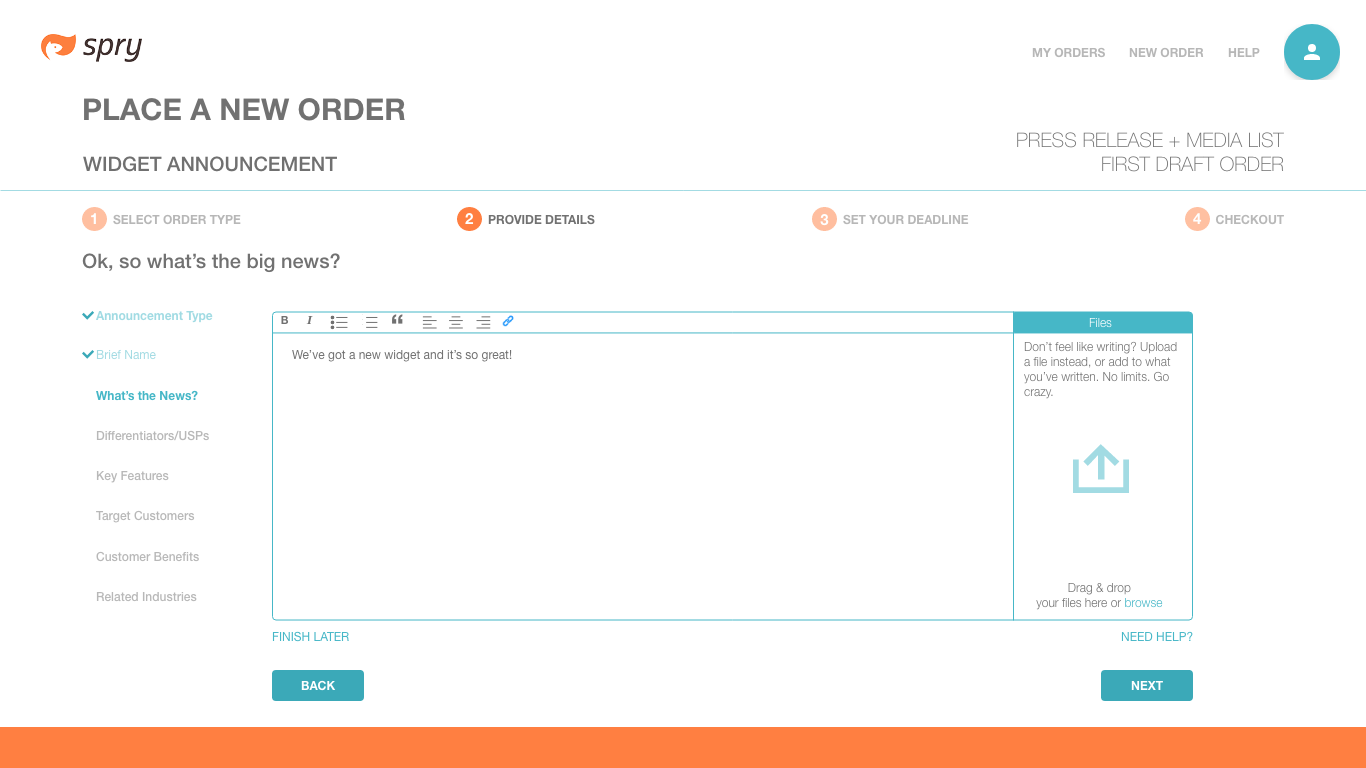
Once a product (or products) had been selected, the user was moved through a guided process of providing specific information for the freelancer who would eventually build the product. First drafts of this process flow were fairly limited and only gave minimal information about where the user was in what could sometimes be a lengthy process. Conveying that process information became a key focus of the final design.
RESULT
Spry was “the first on-demand mobile PR network” and attempted to disrupt the established public relations business. Currently, the PR industry thrives on the agency/billable hour model. Spry introduced the gig economy to this space, connecting those needing communications services with PR freelancers, cutting out the expensive agencies and making PR accessible to anyone who needed it. Originally only a mobile application, my work centered on creating a web version of the Spry platform. Unfortunately, Spry was shut down by its holding company owners before the web app was completed.